import pandas as pd
import numpy as np
import matplotlib.pyplot as plt
import seaborn as sns
from scipy import stats

# Set random seed for reproducibility
np.random.seed(42)

# Sample size
n = 1000

# Generate demographic data with realistic distributions
male_count = int(n * 0.6)
female_count = n - male_count

# Height data with sex-specific distributions
male_heights = np.random.normal(175, 7, male_count)
female_heights = np.random.normal(165, 6, female_count)
male_heights = np.clip(male_heights, 160, 195)
female_heights = np.clip(female_heights, 150, 185)
heights = np.concatenate([male_heights, female_heights])

# Weight data correlated with height
male_weights = male_heights * 0.4 + np.random.normal(0, 5, male_count)
female_weights = female_heights * 0.35 + np.random.normal(0, 4, female_count)
weights = np.concatenate([male_weights, female_weights])

# Categorical variables
sex = ['Male'] * male_count + ['Female'] * female_count
education_levels = np.random.choice(
    ['High School', "Bachelor's", "Master's"],
    n,
    p=[0.3, 0.5, 0.2]
)

# Salary data dependent on education level
salaries = []
for edu in education_levels:
    if edu == 'High School':
        salaries.append(np.random.normal(3000, 1000))
    elif edu == "Bachelor's":
        salaries.append(np.random.normal(5000, 1500))
    else:
        salaries.append(np.random.normal(6000, 1000))

# Construct DataFrame
people = pd.DataFrame({
    'Height': np.round(heights, 1),
    'Weight': np.round(weights, 1),
    'Sex': sex,
    'Education': pd.Categorical(
        education_levels,
        categories=['High School', "Bachelor's", "Master's"],
        ordered=True
    ),
    'Salary': np.ceil(salaries).astype(int)
})Histogram: Distribution of Quantitative Variables
A histogram displays the distribution of a quantitative variable by partitioning the range into bins and counting observations within each bin. Histograms reveal central tendency, spread, skewness, and modality of distributions.
When to Use:
- Examining the distribution of a single quantitative variable
- Identifying the shape of the distribution (normal, skewed, bimodal)
- Detecting outliers and unusual values
- Assessing whether data meets distributional assumptions for statistical tests
Implementation Considerations:
- Bin width selection affects pattern visibility
- Too few bins obscure distribution details
- Too many bins create noise from sampling variation
- Sturges’ rule: \(k = \lceil \log_2(n) + 1 \rceil\) bins for \(n\) observations
- Kernel density estimation (KDE) provides smooth density curves
plt.figure(figsize=(8, 5))
sns.histplot(data=people, x='Height', bins=20, kde=True)
plt.title('Distribution of Height')
plt.xlabel('Height (cm)')
plt.ylabel('Frequency')
plt.show()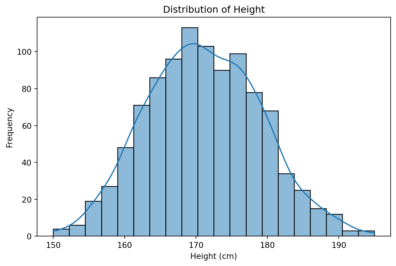
Explanation: The histogram displays the distribution of heights across all observations. The distribution exhibits bimodality, reflecting the underlying sex-specific height distributions. The kernel density estimate curve provides a smoothed representation of the underlying density function. The choice of 20 bins balances detail resolution with noise reduction. The presence of two modes suggests a mixture distribution, motivating stratified analysis by sex.
Bar Plot: Frequency of Categorical Variables
Bar plots display frequencies or proportions of categorical variables using bar height to encode counts. Unlike histograms, bars are separated to emphasize the discrete nature of categories.
When to Use:
- Comparing frequencies across categories
- Displaying proportions or percentages
- Showing counts for nominal or ordinal categorical variables
- Comparing category prevalence in different groups
Design Principles:
- Bars should start at zero to avoid distorting magnitude perception
- Order categories meaningfully (by frequency, natural order, or alphabetically)
- Use consistent bar width across categories
- Maintain clear visual distinction between categories
plt.figure(figsize=(7, 5))
sns.countplot(data=people, x='Sex', palette='Set2')
plt.title('Distribution of Sex')
plt.xlabel('Sex')
plt.ylabel('Count')
plt.show()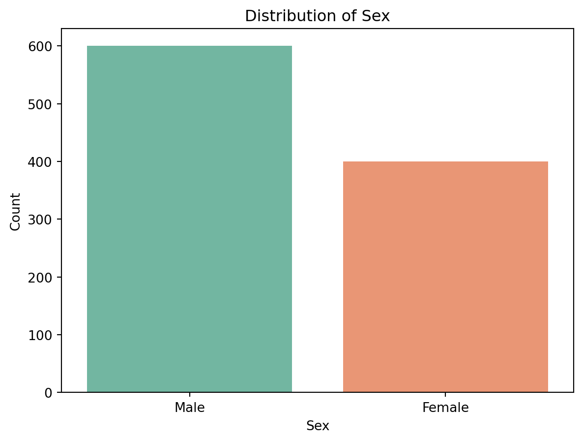
Explanation: The bar plot displays the frequency distribution of sex categories in the dataset. The sample contains 600 males (60%) and 400 females (40%), reflecting the designed sampling proportions. The bar heights accurately represent relative frequencies, with the y-axis beginning at zero to avoid visual distortion.
Box Plot: Distribution Comparison Across Categories
Box plots (box-and-whisker plots) summarize the distribution of a quantitative variable across categorical groups using five-number summaries: minimum, first quartile (Q1), median (Q2), third quartile (Q3), and maximum. The box spans the interquartile range (IQR = Q3 - Q1), while whiskers extend to extreme values within 1.5×IQR from the quartiles.
When to Use:
- Comparing distributions of a quantitative variable across categories
- Identifying differences in central tendency and spread between groups
- Detecting outliers defined as values beyond 1.5×IQR from quartiles
- Assessing distributional assumptions for analysis of variance
Interpretation:
- Box width represents IQR, indicating spread
- Line inside box marks median, showing central tendency
- Whisker length indicates range of typical values
- Points beyond whiskers indicate outliers
plt.figure(figsize=(9, 6))
sns.boxplot(data=people, x='Education', y='Salary', palette='Set2')
plt.title('Salary Distribution by Education Level')
plt.xlabel('Education Level')
plt.ylabel('Monthly Salary (USD)')
plt.show()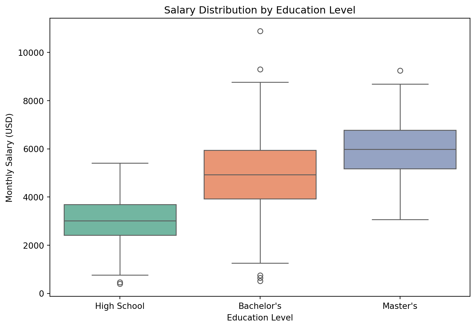
Explanation: The box plot reveals how salary distributions vary across education levels. Median salary increases monotonically with educational attainment, consistent with human capital theory. The Master’s degree category exhibits higher median salary and wider spread compared to Bachelor’s and High School categories. Several observations appear as outliers (points beyond whiskers), representing individuals with salaries substantially above or below typical values for their education level. The overlapping boxes between Bachelor’s and Master’s categories indicate some salary range overlap despite different median values.
Violin Plot: Density and Distribution Across Categories
Violin plots combine features of box plots and kernel density plots to display the full distribution of data across categories. The violin width at each y-value represents the density of observations at that value, revealing distribution shape beyond summary statistics.
When to Use:
- Visualizing complete distribution shape across categories
- Comparing multimodal or skewed distributions between groups
- Examining distribution symmetry and tail behavior
- Situations requiring more detail than box plots provide
Comparison with Box Plots:
- Violin plots reveal distribution shape (unimodal, bimodal, skewed)
- Box plots emphasize quartiles and outliers
- Violin plots better show multimodality
- Box plots more clearly identify individual outliers
plt.figure(figsize=(8, 6))
sns.violinplot(data=people, x='Sex', y='Weight', palette='pastel', inner='quartile')
plt.title('Weight Distribution by Sex')
plt.xlabel('Sex')
plt.ylabel('Weight (kg)')
plt.show()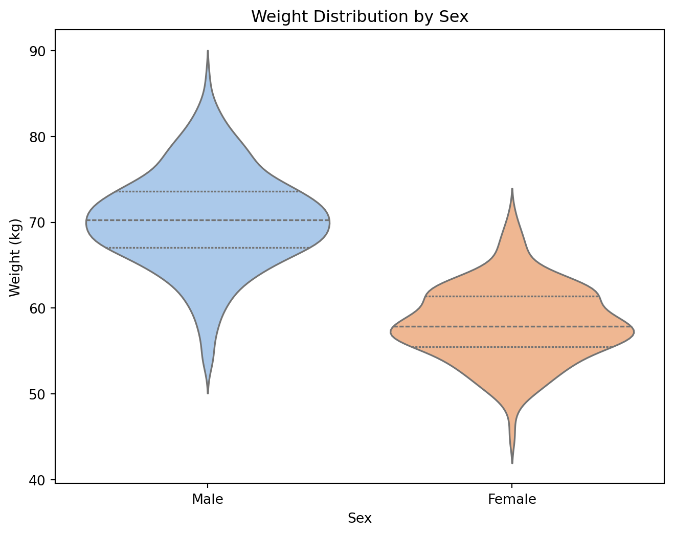
Explanation: The violin plot displays the complete distribution of weight for each sex category. The violin width at any height represents the density of observations at that weight value. Males exhibit higher median weight and wider distribution compared to females, consistent with sex differences in body composition. The violin shapes appear approximately symmetric and unimodal for both sexes. The inner quartile lines (short horizontal bars) indicate the interquartile range, combining density information with summary statistics.
Visual Comparison: Box Plot vs. Violin Plot
plt.figure(figsize=(6, 5))
sns.boxplot(data=people, x='Sex', y='Height', palette='Set2')
plt.title('Box Plot of Height by Sex')
plt.xlabel('Sex')
plt.ylabel('Height (cm)')
plt.show()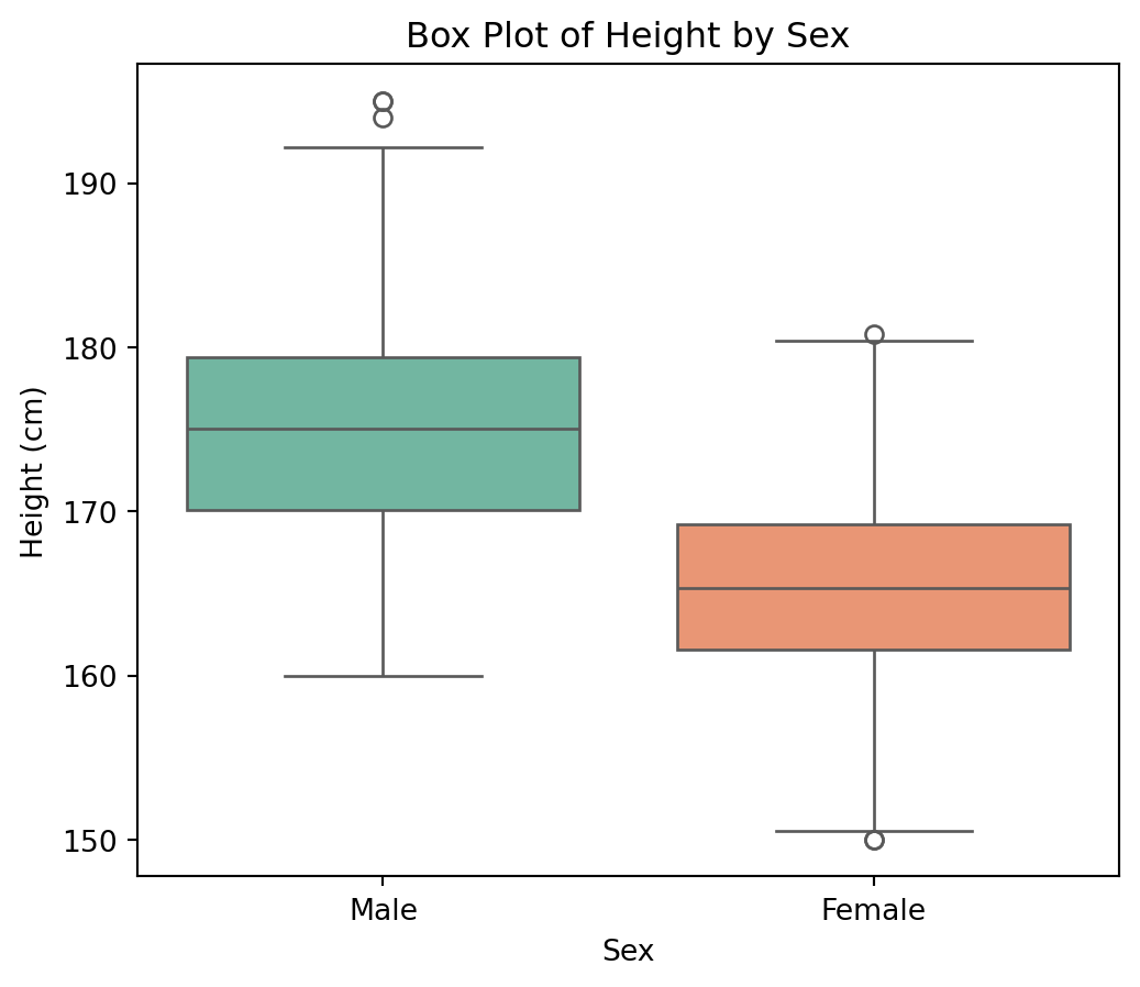
Box Plot: Emphasizes median, quartiles, and outliers. Effective for quick comparison of central tendency and spread across categories. Does not reveal distribution shape or multimodality.
plt.figure(figsize=(6, 5))
sns.violinplot(data=people, x='Sex', y='Height', palette='pastel', inner='quartile')
plt.title('Violin Plot of Height by Sex')
plt.xlabel('Sex')
plt.ylabel('Height (cm)')
plt.show()
Violin Plot: Reveals complete distribution shape through density estimation. Shows whether distributions are symmetric, skewed, or multimodal. Combines density information with quartile markers.
Strip Plot: Individual Observations Across Categories
Strip plots display individual data points for each category along one axis, providing visibility into the raw data underlying summary statistics. When sample sizes are moderate, strip plots reveal the actual distribution of observations rather than smoothed approximations.
When to Use:
- Displaying individual observations alongside or instead of summary plots
- Moderate sample sizes where individual points remain distinguishable
- Detecting patterns, clusters, or gaps in the data
- Complementing box plots or violin plots to show raw data
Design Considerations:
- Jitter adds horizontal noise to prevent overplotting
- Alpha transparency reveals density when points overlap
- Combine with box or violin plots for comprehensive display
- Less effective with very large sample sizes due to overplotting
plt.figure(figsize=(9, 6))
sns.stripplot(data=people, x='Education', y='Salary', hue='Sex',
              dodge=True, alpha=0.5, jitter=True, palette='Set1')
plt.title('Salary Distribution by Education Level and Sex')
plt.xlabel('Education Level')
plt.ylabel('Monthly Salary (USD)')
plt.legend(title='Sex', bbox_to_anchor=(1.02, 1), loc='upper left')
plt.tight_layout()
plt.show()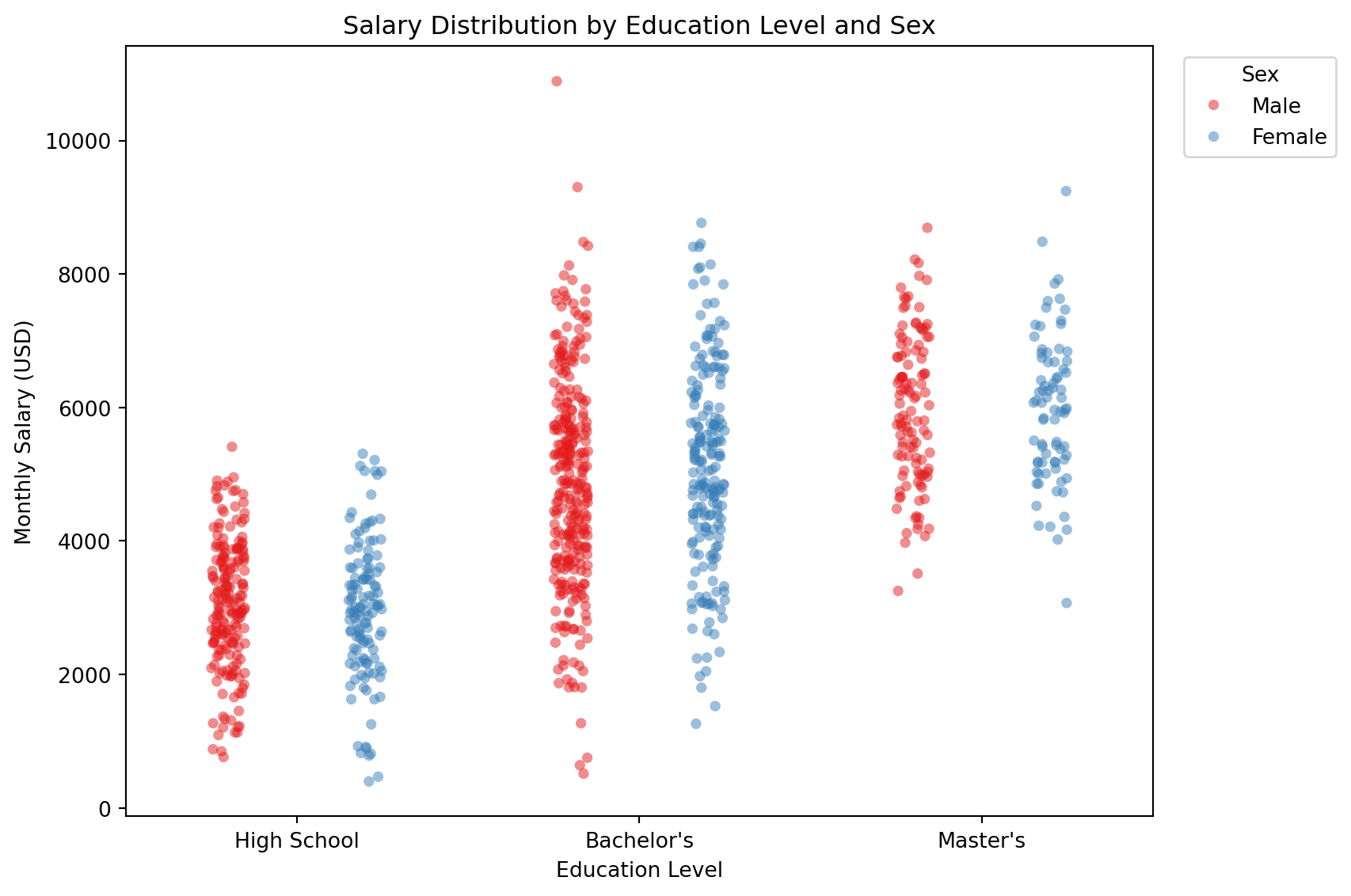
Explanation: The strip plot displays each individual salary observation positioned by education level and colored by sex. Horizontal jittering separates overlapping points, revealing the density of observations at different salary values. The dodge parameter separates male and female observations within each education category, enabling direct comparison. Unlike box plots or violin plots that summarize distributions, strip plots preserve information about individual observations, making them valuable for detecting unusual patterns, clusters, or gaps in the data. The transparency (alpha) setting helps visualize overlapping points in densely populated regions.
Visual Comparison: Box Plot with Strip Plot Overlay
Combining box plots with strip plots provides both summary statistics and individual observation visibility. This hybrid approach is particularly effective for communicating distribution characteristics to diverse audiences.
plt.figure(figsize=(9, 6))
sns.boxplot(data=people, x='Education', y='Salary', palette='pastel', width=0.5)
sns.stripplot(data=people, x='Education', y='Salary', color='darkblue',
              alpha=0.3, jitter=True, size=4)
plt.title('Salary Distribution by Education Level')
plt.xlabel('Education Level')
plt.ylabel('Monthly Salary (USD)')
plt.show()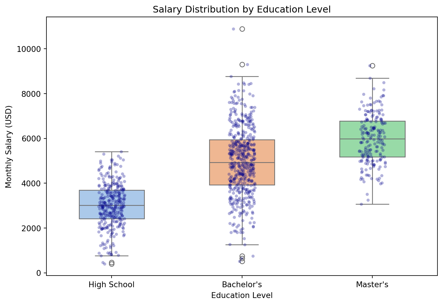
Explanation: The overlay combines box plot summary statistics with individual observations from the strip plot. The box plot provides immediate visual access to median, quartiles, and outlier boundaries, while the strip plot reveals the actual density and distribution of individual data points. This combination addresses the limitation of box plots (hiding raw data) while maintaining the interpretive clarity of five-number summaries. The transparency and reduced point size prevent the strip plot from obscuring the box plot elements.
Grouped Bar Plot: Frequencies Across Multiple Categories
Grouped bar plots display frequencies or values for combinations of two categorical variables by placing bars side-by-side within each category. This visualization enables comparison of one categorical variable’s distribution across levels of another categorical variable.
When to Use:
- Comparing frequencies or values across two categorical variables
- Examining how category proportions vary across groups
- Displaying contingency table data graphically
- Showing interaction patterns between categorical factors
Design Principles:
- Group related bars together with consistent spacing
- Use distinct colors for the grouping variable
- Maintain consistent bar widths within and across groups
- Include clear legends to identify group membership
plt.figure(figsize=(9, 6))
sns.countplot(data=people, x='Education', hue='Sex', palette='Set2')
plt.title('Education Level Distribution by Sex')
plt.xlabel('Education Level')
plt.ylabel('Count')
plt.legend(title='Sex')
plt.show()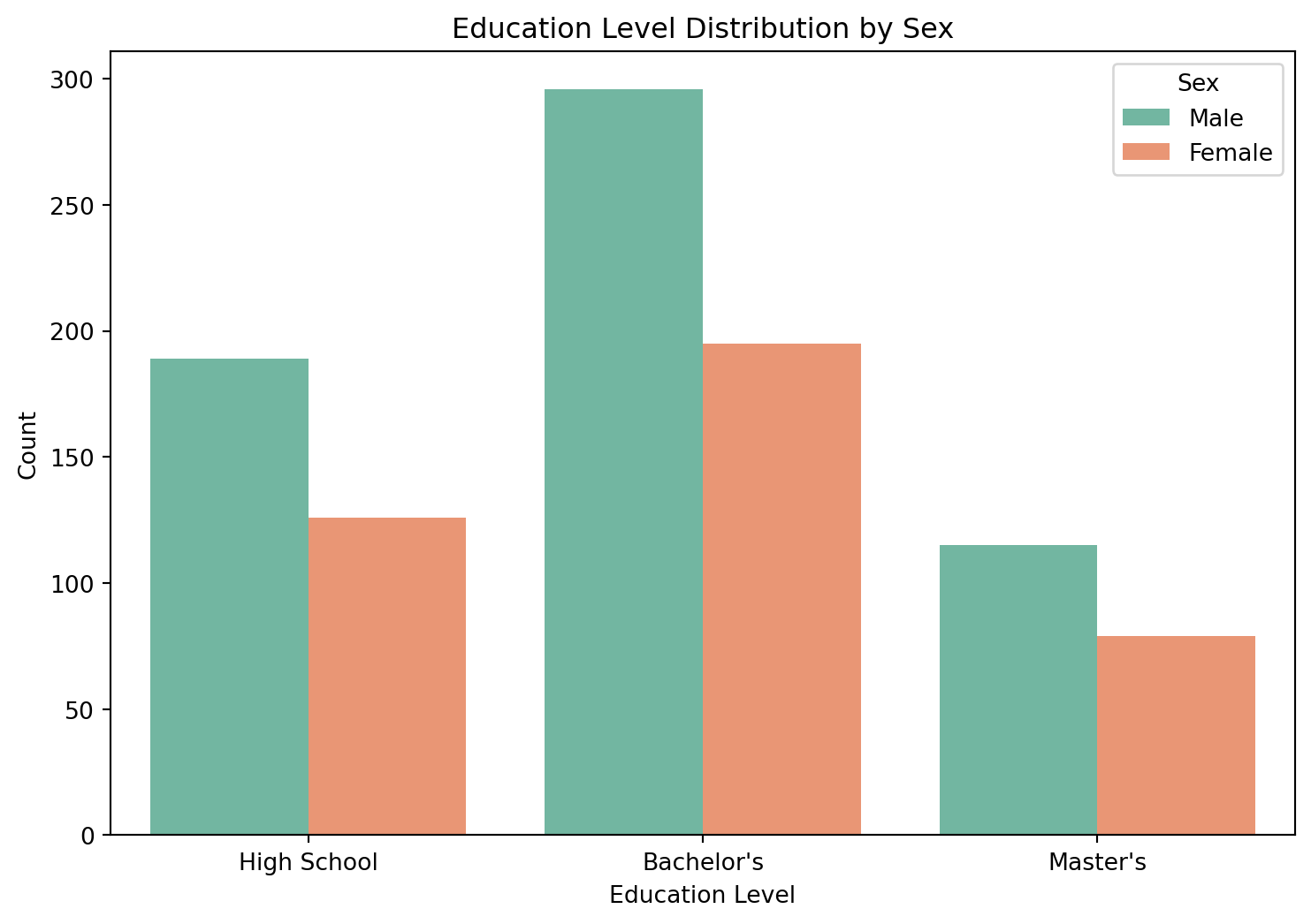
Explanation: The grouped bar plot displays the frequency of each education level separately for males and females. Within each education category, side-by-side bars enable direct comparison of counts between sexes. The visualization reveals whether educational attainment patterns differ by sex. In this dataset, both sexes show similar proportional distributions across education levels, with Bachelor’s degrees being most common, followed by High School and Master’s degrees. The grouped structure facilitates comparison both within education levels (comparing sexes) and across education levels (comparing relative frequencies).
Stacked Bar Plot: Proportional Composition
Stacked bar plots display frequencies by stacking bars for subcategories on top of each other, emphasizing part-to-whole relationships and total counts within each primary category.
When to Use:
- Emphasizing total counts across primary categories
- Showing how subcategories contribute to overall totals
- Comparing composition across groups
- Situations where relative proportions within groups are of interest
Comparison with Grouped Bar Plots:
- Stacked plots emphasize totals and part-to-whole relationships
- Grouped plots facilitate direct comparison between subcategories
- Stacked plots make bottom category comparison easier than middle/top categories
- Grouped plots provide equal comparison accuracy across all subcategories
# Calculate counts for stacked bar plot
education_sex_counts = people.groupby(['Education', 'Sex'], observed=True).size().unstack(fill_value=0)

plt.figure(figsize=(9, 6))
education_sex_counts.plot(kind='bar', stacked=True, color=['#66c2a5', '#fc8d62'],
                          edgecolor='white', linewidth=0.5)
plt.title('Education Level Distribution by Sex (Stacked)')
plt.xlabel('Education Level')
plt.ylabel('Count')
plt.legend(title='Sex')
plt.xticks(rotation=0)
plt.show()
<Figure size 864x576 with 0 Axes>Education level composition by sex showing proportional breakdown
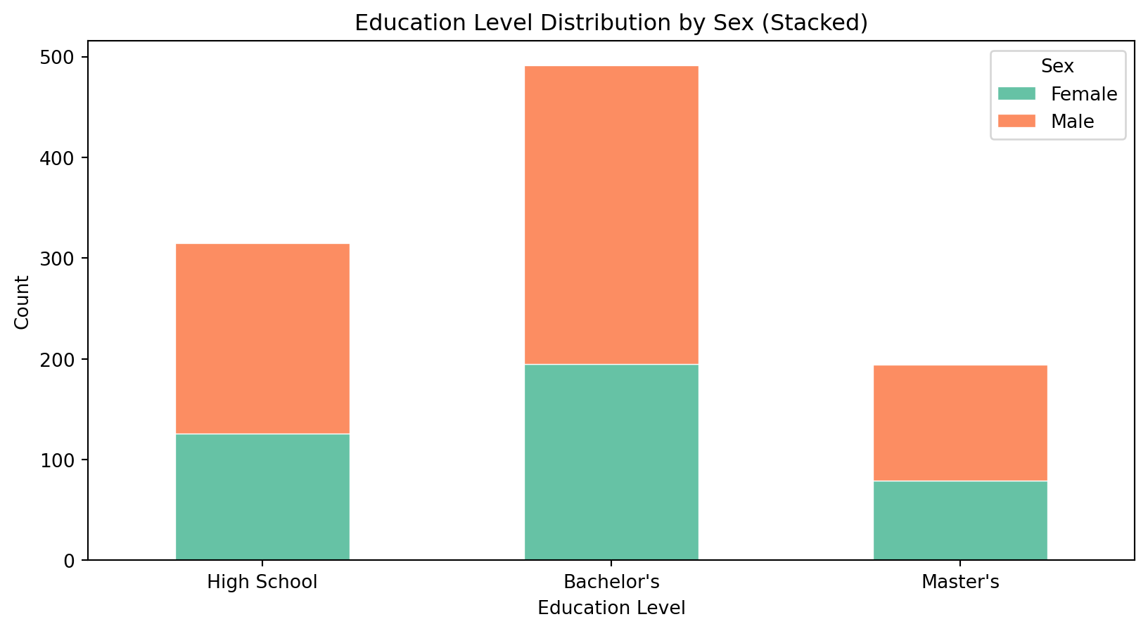
Explanation: The stacked bar plot displays the same data as the grouped bar plot but with a different visual emphasis. Each bar represents the total count for an education level, with segments showing the contribution of each sex. This format makes total counts immediately apparent and reveals the proportional composition within each education category. The stacked format is particularly effective when total counts across categories are of primary interest, though it makes precise comparison of the upper (Male) segments more difficult than the lower (Female) segments.
Scatter Plot: Relationship Between Quantitative Variables
Scatter plots display the relationship between two quantitative variables by plotting observations as points in two-dimensional space. The pattern of points reveals correlation strength, linearity, and presence of outliers or subgroups.
When to Use:
- Examining relationships between two quantitative variables
- Identifying correlation type (positive, negative, or absent)
- Detecting linearity or non-linearity in relationships
- Identifying clusters, outliers, or subgroups
- Validating regression assumptions
Interpretation:
- Positive correlation: points trend upward from left to right
- Negative correlation: points trend downward from left to right
- No correlation: points show no systematic pattern
- Linear relationship: points approximate a straight line
- Non-linear relationship: points follow a curve
plt.figure(figsize=(9, 6))
sns.scatterplot(data=people, x='Height', y='Weight', hue='Sex', alpha=0.6)
plt.title('Weight vs. Height by Sex')
plt.xlabel('Height (cm)')
plt.ylabel('Weight (kg)')
plt.show()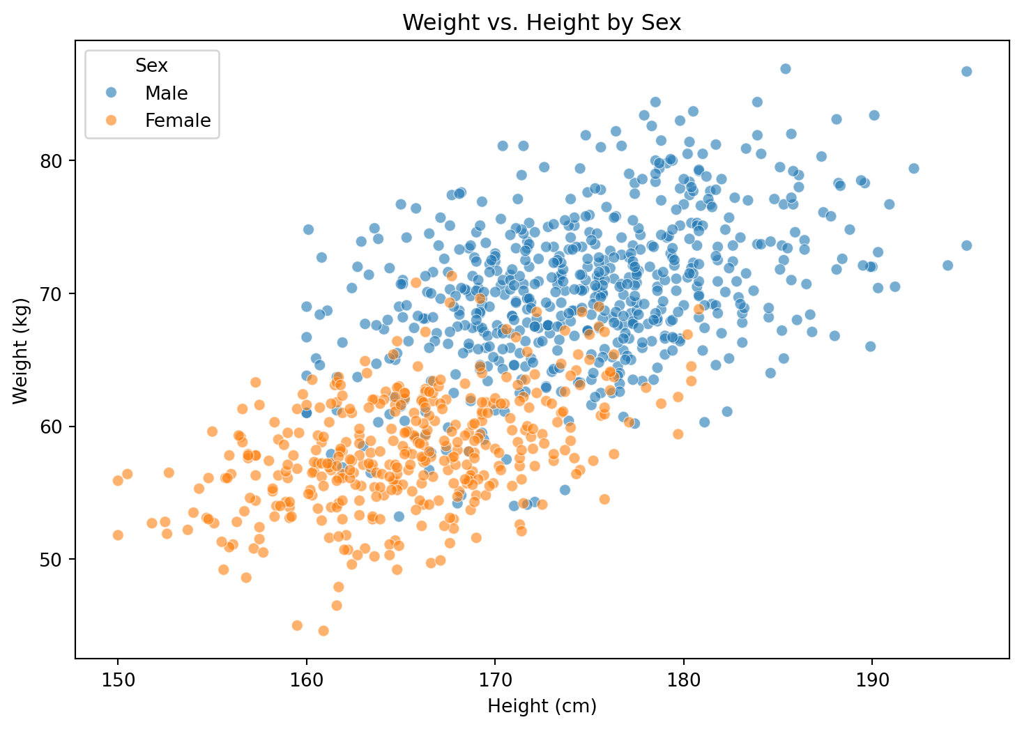
Explanation: The scatter plot reveals a strong positive correlation between height and weight, consistent with the generative model (\(r \approx 0.8\)). Color encoding by sex reveals two partially overlapping clusters, with males generally exhibiting higher values for both variables. The linear relationship suggests that simple linear regression would appropriately model the height-weight relationship. The presence of some scatter around the linear trend indicates the influence of individual variation beyond the height effect.
Heatmap: Correlation Matrix Visualization
Heatmaps encode numerical values using color intensity, facilitating pattern recognition in matrices. Correlation heatmaps visualize pairwise Pearson correlation coefficients between multiple quantitative variables, with color intensity representing correlation strength and color hue representing direction.
When to Use:
- Visualizing correlation structure among multiple variables
- Identifying strongly correlated variable pairs
- Detecting multicollinearity before regression modeling
- Exploring relationships in high-dimensional data
Interpretation:
- Color intensity: correlation strength (0 = no correlation, 1 = perfect correlation)
- Warm colors (red/orange): positive correlation
- Cool colors (blue/purple): negative correlation
- Diagonal: variables perfectly correlate with themselves (correlation = 1)
plt.figure(figsize=(8, 6))
correlation_matrix = people[['Height', 'Weight', 'Salary']].corr()
sns.heatmap(correlation_matrix, annot=True, fmt='.3f', cmap='coolwarm', center=0)
plt.title('Correlation Matrix: Height, Weight, and Salary')
plt.show()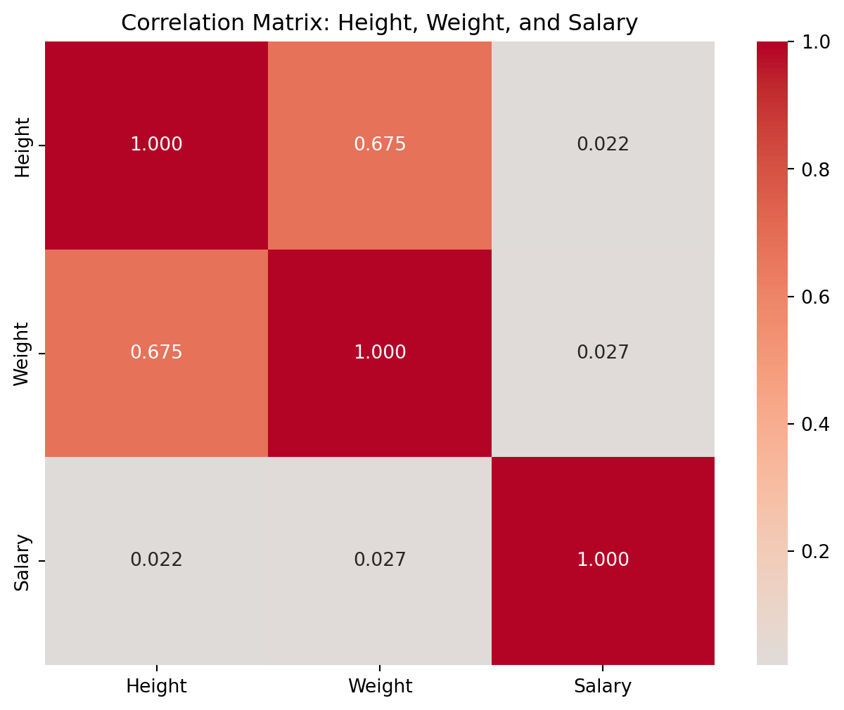
Explanation: The correlation matrix quantifies pairwise linear relationships among height, weight, and salary. Height and weight exhibit strong positive correlation (\(r = 0.819\)), reflecting the physical relationship between body dimensions. Salary shows weak positive correlation with both height (\(r = 0.062\)) and weight (\(r = 0.024\)), suggesting minimal linear relationship between physical characteristics and income in this dataset. The symmetric matrix structure (values mirrored across diagonal) follows from the symmetric property of correlation: \(\text{cor}(X, Y) = \text{cor}(Y, X)\).
Pair Plot: Scatter Plot Matrix for Multivariate Exploration
Pair plots (scatter plot matrices) display pairwise relationships between all combinations of quantitative variables in a single visualization. Diagonal panels typically show univariate distributions, while off-diagonal panels display bivariate scatter plots. This comprehensive view facilitates rapid exploration of multivariate data structures.
When to Use:
- Exploratory analysis of datasets with multiple quantitative variables
- Identifying which variable pairs exhibit strong relationships
- Detecting clusters, outliers, or subgroups across multiple dimensions
- Initial data exploration before formal modeling
- Examining how relationships vary across categorical groupings
Implementation Considerations:
- Computational and visual complexity increases with number of variables
- Most effective with 3-6 quantitative variables
- Color encoding by categorical variable reveals group-specific patterns
- Diagonal can display histograms, KDE plots, or other univariate summaries
sns.pairplot(data=people, vars=['Height', 'Weight', 'Salary'], hue='Sex',
             palette='Set1', diag_kind='kde', plot_kws={'alpha': 0.6})
plt.suptitle('Pairwise Relationships: Height, Weight, and Salary by Sex', y=1.02)
plt.show()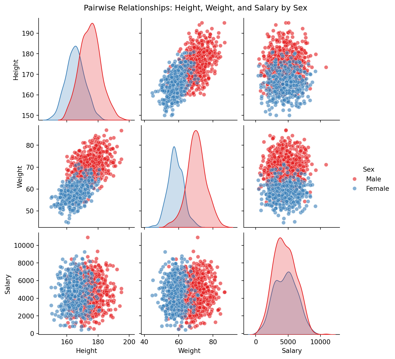
Explanation: The pair plot provides a comprehensive view of relationships among height, weight, and salary, stratified by sex. Diagonal panels display kernel density estimates for each variable, revealing the sex-specific distributions. Off-diagonal scatter plots show bivariate relationships, with the height-weight panel exhibiting the strongest positive correlation. The color stratification reveals that male and female clusters are largely separable in the height-weight space but show substantial overlap in salary-related panels. This visualization efficiently identifies the height-weight relationship as the dominant bivariate pattern while confirming weak relationships between physical characteristics and salary.
Faceted Plots: Small Multiples for Subgroup Comparison
Faceted plots (small multiples) display the same visualization type across subsets of data defined by categorical variables. By maintaining consistent axes and scales across panels, faceted plots enable direct comparison of patterns across groups while avoiding the visual clutter of overlaid elements.
When to Use:
- Comparing distributions or relationships across categorical subgroups
- Situations where overlaying groups would create visual clutter
- Examining how patterns vary across factor levels
- Displaying conditional distributions or relationships
Design Principles:
- Maintain consistent axis scales across all panels for valid comparison
- Use clear panel labels to identify subgroups
- Arrange panels in meaningful order (natural, alphabetical, or by value)
- Limit the number of faceting levels to avoid excessive fragmentation
g = sns.FacetGrid(people, col='Education', height=4, aspect=1.2)
g.map_dataframe(sns.histplot, x='Salary', kde=True, bins=20)
g.set_axis_labels('Monthly Salary (USD)', 'Frequency')
g.set_titles('{col_name}')
g.figure.suptitle('Salary Distribution by Education Level', y=1.02)
plt.show()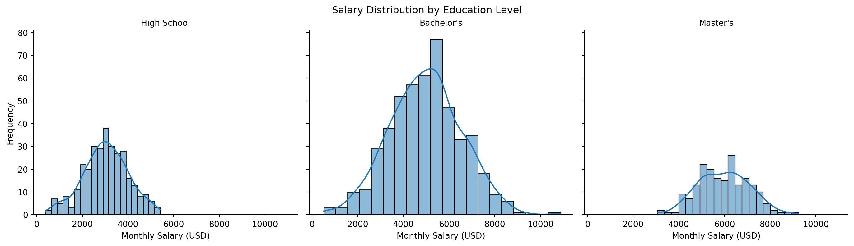
Explanation: The faceted histogram displays salary distributions separately for each education level, arranged in ordered columns. This layout reveals how both the central tendency and spread of salaries change with educational attainment. High School graduates exhibit lower median salary with moderate spread, Bachelor’s degree holders show intermediate values with increased variability, and Master’s degree holders display the highest median with relatively tight distribution. The consistent x-axis scale across panels enables direct comparison of both location and spread. Faceting avoids the visual complexity of overlaid distributions while preserving the ability to compare distribution shapes.
Faceted Scatter Plots: Relationships Across Subgroups
Faceting can be applied to any visualization type, including scatter plots, to examine how bivariate relationships vary across categorical subgroups.
g = sns.FacetGrid(people, col='Education', hue='Sex', height=4, aspect=1.0,
                  palette='Set1')
g.map_dataframe(sns.scatterplot, x='Height', y='Weight', alpha=0.6)
g.set_axis_labels('Height (cm)', 'Weight (kg)')
g.set_titles('{col_name}')
g.add_legend(title='Sex')
g.figure.suptitle('Height-Weight Relationship by Education Level and Sex', y=1.02)
plt.show()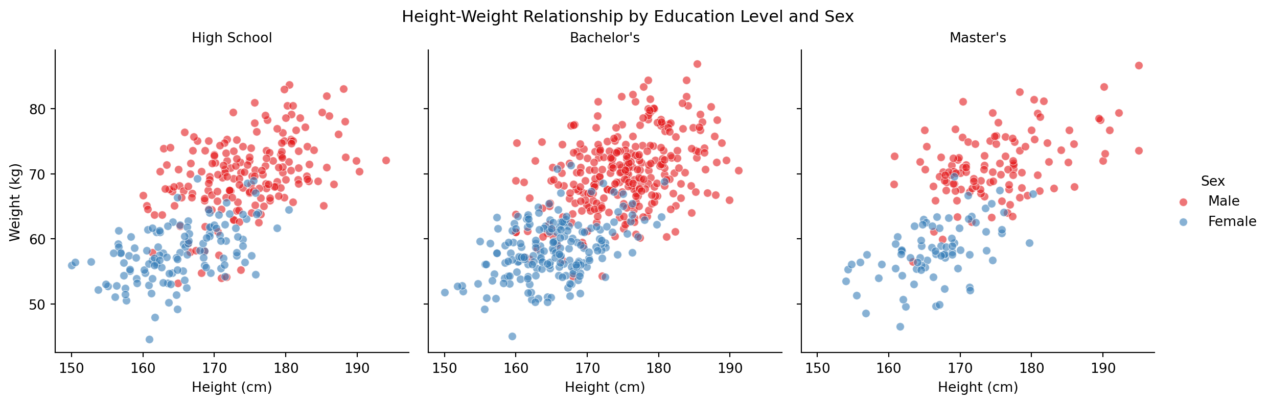
Explanation: The faceted scatter plot displays the height-weight relationship separately for each education level, with sex indicated by color. The consistent positive correlation between height and weight appears across all education levels, suggesting that this physical relationship is independent of educational attainment. The sex-based clustering pattern also remains consistent across panels. This visualization confirms that the height-weight relationship is stable across educational subgroups, while the faceting structure makes group-specific patterns immediately visible without the visual complexity of a single overcrowded plot.
Pie Chart: Proportional Representation
Pie charts represent the composition of a categorical variable by dividing a circle into sectors proportional to category frequencies. The area (and angle) of each sector encodes its proportion of the whole.
When to Use:
- Displaying part-to-whole relationships for categorical variables
- Showing proportions when categories sum to 100%
- Communicating simple proportional breakdowns to general audiences
- Limited categories (3-5 maximum for readability)
Limitations:
- Human perception estimates angles and areas less accurately than lengths
- Difficult to compare values across multiple pie charts
- Ineffective with many categories or similar proportions
- Bar charts often communicate the same information more effectively
When to Avoid:
- More than 5-6 categories (use bar chart instead)
- Precise value comparison required (use bar chart)
- Comparing distributions across groups (use grouped bar chart)
- Time-series or ordered data (use line or bar chart)
plt.figure(figsize=(8, 6))
education_counts = people['Education'].value_counts()
plt.pie(education_counts, labels=education_counts.index, autopct='%1.1f%%', startangle=90)
plt.title('Distribution of Education Levels')
plt.axis('equal')
plt.show()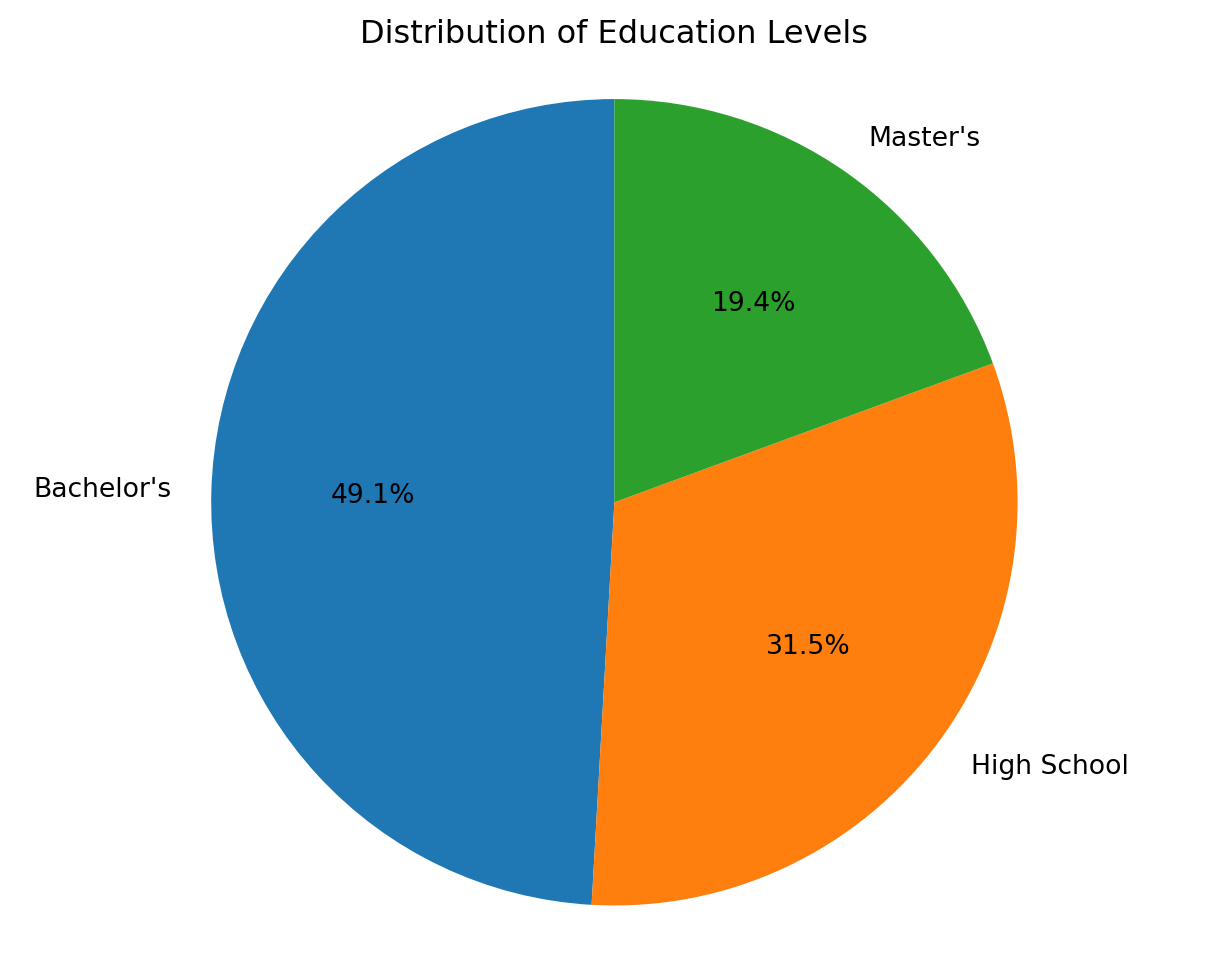
Explanation: The pie chart displays the proportional distribution of education levels in the dataset. Bachelor’s degree holders constitute the largest group (50.4%), followed by High School (28.9%) and Master’s degrees (20.7%). While pie charts effectively communicate simple proportional breakdowns, a bar chart would enable more precise value comparison and would scale better to additional categories.
Line Plot: Trends Over Time
Line plots display the evolution of quantitative variables over time or another ordered sequence. Connected points emphasize continuity and facilitate trend identification, making line plots the standard visualization for time-series data.
When to Use:
- Displaying trends over time or ordered sequences
- Comparing multiple time series on the same scale
- Identifying patterns: trends, seasonality, cycles, and anomalies
- Showing continuous change in a measured variable
Design Considerations:
- Use chronological ordering on x-axis
- Include meaningful axis labels with units
- Use legends when plotting multiple series
- Consider logarithmic scales for exponential growth
- Include grid lines to facilitate value reading
# Suppress yfinance download messages
import warnings
warnings.filterwarnings('ignore')

import yfinance as yf

# Download historical stock data
apple = yf.download("AAPL", start="2000-01-01", end="2026-01-01", progress=False)
amazon = yf.download("AMZN", start="2000-01-01", end="2026-01-01", progress=False)
google = yf.download("GOOG", start="2004-08-19", end="2026-01-01", progress=False)

# Create line plot
plt.figure(figsize=(12, 6))
plt.plot(apple.index, apple['Close'], label='Apple (AAPL)')
plt.plot(amazon.index, amazon['Close'], label='Amazon (AMZN)')
plt.plot(google.index, google['Close'], label='Google (GOOG)')
plt.title('Stock Price Comparison: AAPL, AMZN, GOOG (2000-2025)')
plt.xlabel('Date')
plt.ylabel('Closing Price (USD)')
plt.legend()
plt.show()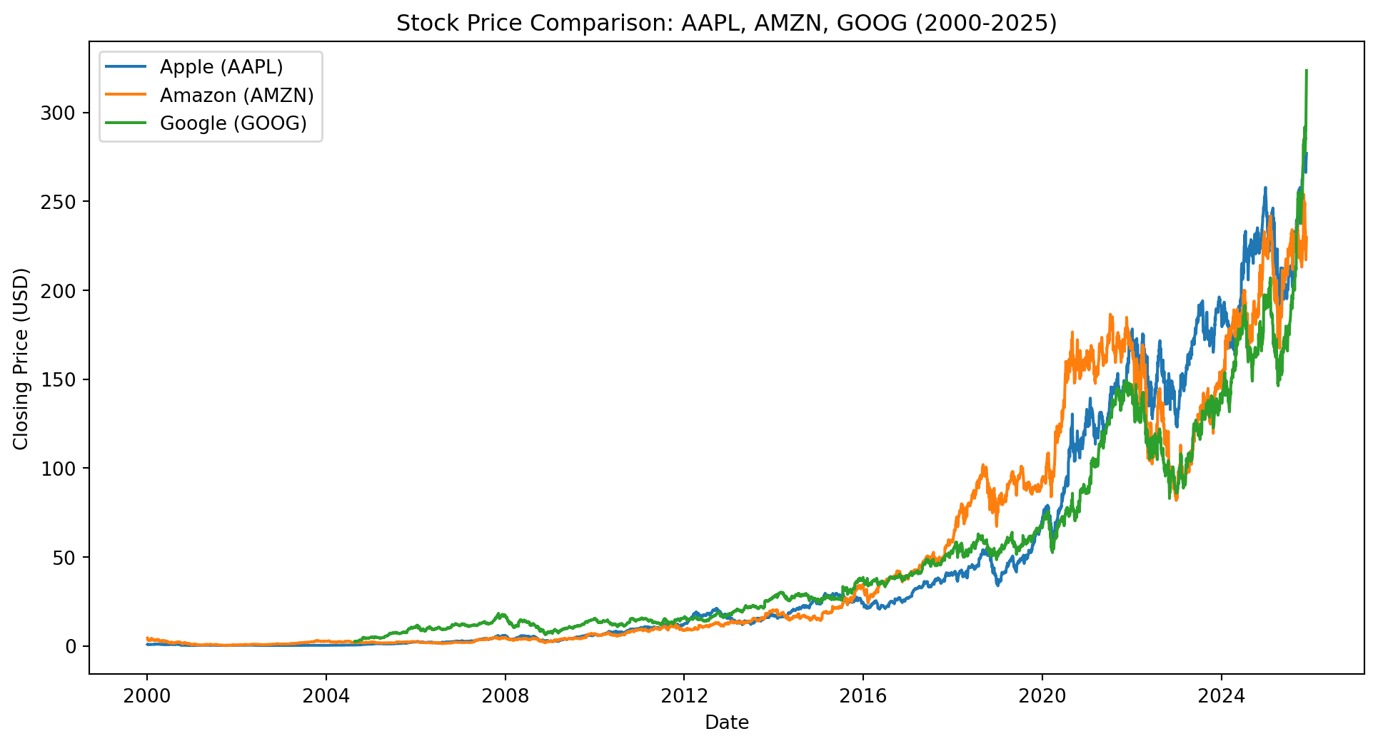
Explanation: The line plot compares closing stock prices for Apple, Amazon, and Google over two decades. All three companies exhibit substantial long-term growth, with periods of volatility corresponding to market events (2001 dot-com crash, 2008 financial crisis, 2020 pandemic). Amazon shows the most dramatic price appreciation, particularly after 2015. Google’s data begins in August 2004 following its initial public offering. Line plots effectively reveal both long-term trends and short-term volatility in time-series financial data. The shared y-axis enables direct price comparison, though percentage change or normalized scales would better compare relative performance.
QQ Plot: Assessing Distributional Assumptions
Quantile-quantile (QQ) plots compare the distribution of observed data against a theoretical distribution by plotting corresponding quantiles. For normality assessment, sample quantiles are plotted against theoretical normal quantiles. Deviations from the diagonal reference line indicate departures from the assumed distribution.
When to Use:
- Assessing whether data follow a normal distribution before parametric tests
- Validating distributional assumptions for regression residuals
- Identifying the nature of distributional departures (heavy tails, skewness)
- Comparing two empirical distributions
Interpretation:
- Points along diagonal line: data follow the theoretical distribution
- S-shaped curve: data have heavier or lighter tails than theoretical distribution
- Points above line at right end: right-skewed distribution
- Points below line at left end: left-skewed distribution
- Systematic curvature: fundamental departure from assumed distribution
plt.figure(figsize=(8, 6))
stats.probplot(people['Height'], dist='norm', plot=plt)
plt.title('QQ Plot: Height Distribution vs. Normal')
plt.xlabel('Theoretical Quantiles')
plt.ylabel('Sample Quantiles')
plt.show()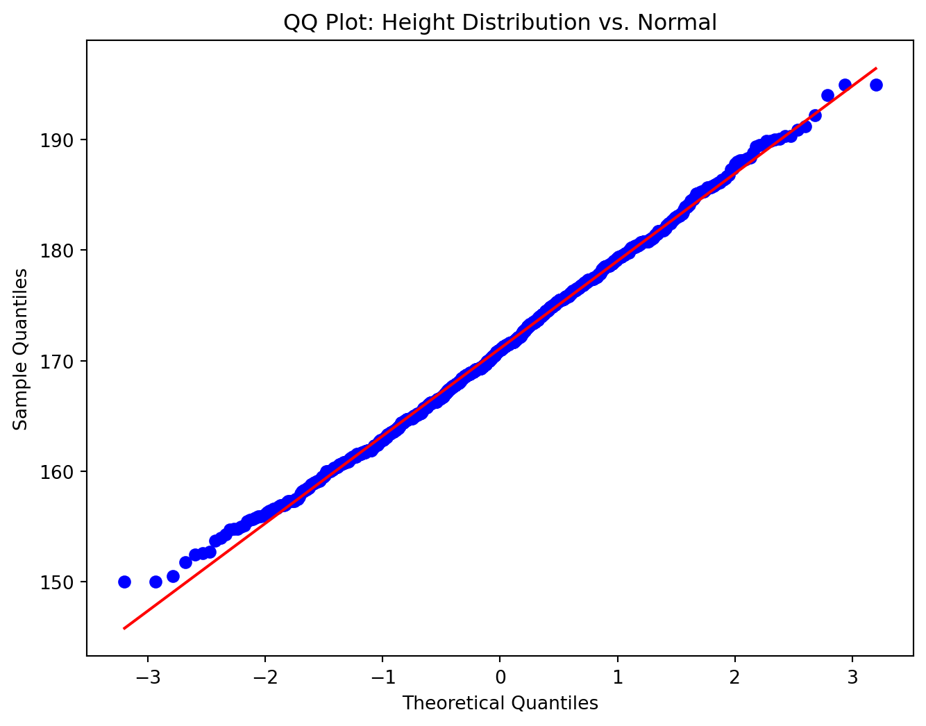
Explanation: The QQ plot compares the observed height distribution against a theoretical normal distribution. Points closely following the diagonal reference line indicate that heights are approximately normally distributed. The slight S-shaped deviation suggests the empirical distribution may have slightly lighter tails than a perfect normal distribution, which is consistent with the clipping applied during data generation. The overall adherence to the diagonal confirms that parametric statistical methods assuming normality would be appropriate for this variable.
QQ Plot Comparison: Normal vs. Non-Normal Distributions
Comparing QQ plots for variables with different distributional characteristics illustrates how departures from normality appear graphically.
plt.figure(figsize=(6, 5))
stats.probplot(people['Weight'], dist='norm', plot=plt)
plt.title('QQ Plot: Weight (Approximately Normal)')
plt.xlabel('Theoretical Quantiles')
plt.ylabel('Sample Quantiles')
plt.show()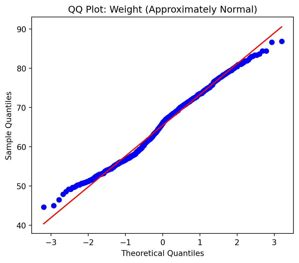
Approximately Normal: Weight follows a roughly normal distribution with minor deviations. Points cluster tightly around the diagonal reference line throughout the range.
plt.figure(figsize=(6, 5))
stats.probplot(people['Salary'], dist='norm', plot=plt)
plt.title('QQ Plot: Salary (Mixture Distribution)')
plt.xlabel('Theoretical Quantiles')
plt.ylabel('Sample Quantiles')
plt.show()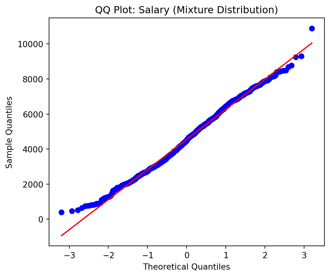
Mixture Distribution: Salary exhibits subtle departures from normality due to the underlying mixture of education-specific distributions. Deviations from the diagonal, particularly in the tails, suggest the data may benefit from stratified analysis or transformation.
Applications and Extensions
Connections to Data Science Workflow:
- Exploratory Data Analysis: Visualizations reveal distributions, relationships, and anomalies
- Model Diagnostics: Residual plots, QQ plots, and diagnostic visualizations validate assumptions
- Communication: Effective visualizations convey findings to diverse audiences
- Feature Engineering: Relationship plots inform feature creation and transformation
- Quality Assurance: Visual inspection detects data errors and inconsistencies
Integration with Previous Topics:
Visualization complements data manipulation and statistical analysis techniques covered in previous lectures. After aggregating and integrating data from multiple sources (Lecture 14), visualization provides essential tools for exploring patterns and communicating results. The exploratory insights gained from visualization inform subsequent modeling decisions and hypothesis formulation.
These techniques form the foundation for comprehensive data exploration and communication. Proficiency with multiple visualization types, combined with understanding of perceptual principles, enables effective transformation of numerical data into actionable insights through visual representation.